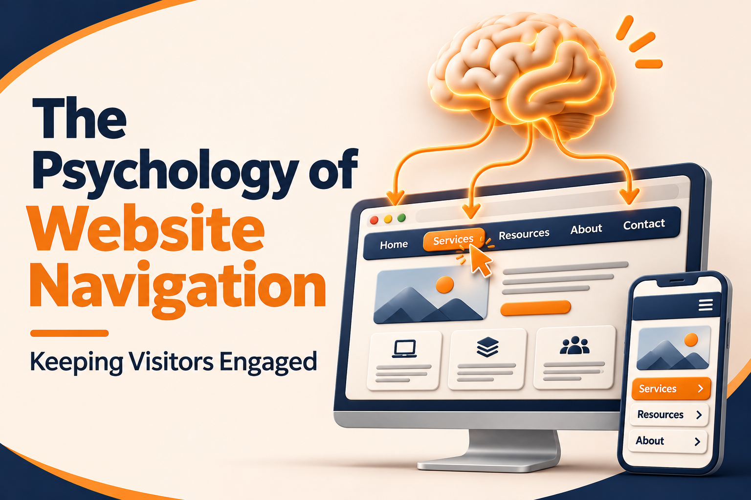
Quick Blog Summary
This blog explains how clear website navigation helps visitors find what they need, stay engaged, and build trust in a business. You’ll learn how simple menu labels, faster loading speeds, predictable layouts, mobile-friendly navigation, and useful links can reduce frustration and improve the user experience. It also covers practical ways to test navigation and track website performance so you can turn more visitors into customers.
Inrtroduction
A visitor arrives at your homepage, looks at the top menu and decides in about 2 seconds. They’re either going to stay and start looking for what they want or they’re going to hit the back button. A lot of that decision is made before they’ve even read a single headline. The menu, the labels, the layout all tell them whether your site makes sense.
At
Digital Maxima we spend a lot of time watching people as they navigate our sites. We run the tests, we watch the session recordings, we talk to clients about why people are leaving. The pattern is pretty much always the same. People don’t leave because the site is ugly. They leave because they can’t find what they came for and the effort involved is greater than the reward. Good navigation removes that friction and the psychology of it is actually pretty straightforward.
Why people hate searching for things
Your brain is all about saving effort. If a page is going to make you think too hard then you’re going to get tired and annoyed very quickly. That’s what cognitive load is all about and every time a website forces the visitor to work out where something is they’re adding to the cognitive load.
Think of a shop where the milk is in the very back corner, the bread is right by the car park and the cereal is tucked away behind the pharmacy counter. You’d walk out of that shop and go somewhere else. Websites are the same. A menu full of ‘Solutions’ and ‘Resources’ and the like is just going to make people go hunting. A menu with clear, unambiguous labels like ‘Pricing’ and ‘Contact’ is the one that lets them move on.
Hick’s Law underpins this. The more choices you present to a person the longer it takes them to make a decision. Too many menu items and you slow them down and they can end up feeling quite stuck. Keep your main choices to a few, clear and easy to scan.
The first seconds decide everything
Visitors form an impression very quickly. As the Nielsen Norman Group have demonstrated time and again, people scan web pages rather than read them line by line and tend to follow an F shaped path across the top and down the left hand side. That means your navigation and your main headline are going to be the things that get the most attention before anything else.
This is why the top of your site is so important. Put your most important links in the place the eye naturally goes. Use plain speak. Tell the visitor precisely what they can do next. A simple layout that answers the questions “Where am I? What can I do here?” is going to be far more effective at holding attention than a clever layout that forces the visitor to work for it.
According to the Nielsen Norman Group, users scan pages and make quick judgments about content, which is why clear labels and predictable layouts tend to keep people moving forward instead of backing out.
Clear labels beat clever labels
Marketing teams will love a good menu name (it’ll sound so fresh in a meeting). The problem is that for the visitor, who is clicking the link for the first time, they have no idea what it actually is. “Growth Lab” may be perfectly sensible to your marketing team but to the visitor it’s a complete mystery.
Use the words your customers actually use when they search. If they’re searching for “web design prices” then name your page that. If they’re searching for “book a call” then name your page that. Descriptive labels reduce uncertainty and reduced uncertainty = people staying on your site.
| Vague label |
Clearer label |
Why it works better |
| Solutions |
Web Design |
Shows exactly what the service is |
| Resources |
Blog and Guides |
Tells visitors what kind of content to expect |
| Our Approach |
How We Work |
Uses everyday language people understand |
| Get Started |
Book a Free Call |
Explains the next step and what it costs |
| Insights |
Case Studies |
Makes the value of the page obvious |
Speed is a feeling as much as a number
Visitors don’t time their page load with a stopwatch, they just feel every extra second. Google have reported that the likelihood of a mobile visit bouncing goes up significantly as load time increases. In their research they found the chance of a bounce increased dramatically when pages went from 1 second to 3 seconds. Waiting is just perceived as friction and friction leads to people leaving.
Speed also has an impact on how people perceive your brand. A slow site just feels untrustworthy regardless of the quality of the content. Fast pages on the other hand feel clean and professional and people are far more likely to engage with them.
The Google Developers site explains that page experience signals, including loading speed, influence how people use and judge a site, which is one reason performance work belongs in every navigation plan.
We’re always recommending the simple fixes first i.e. compress large images, get rid of any scripts you don’t actually need and keep the heavy animations at the top of the page. A small improvement in load time can make a massive difference to dwell time.
Predictable layouts feel safe
People trust what they know. If your logo is in the top left, your menu runs across the top and your contact link is in the top right then you’ve got a site that’s very easy to use. It’s a very predictable layout which reduces the stress on the user and makes the site feel very easy to navigate.
Surprises can work in a creative campaign but navigation is not the place for them. If you move the menu to the bottom of the page or hide it behind some rather odd icon then a large number of visitors are simply going to give up. They’ll assume the site is broken or too complicated.
Consistency across the whole site as well. Same menu on every page. Same button colours and styling. Main call to action in the same place on each page. The familiar patterns that you create like this build confidence as people are navigating the site.
Mobile changes the game
Phones are where the majority of web traffic begins. On a small screen every menu item is in competition for space and every tap is important. A long hidden menu is going to frustrate people who can’t just see their options at a glance.
Keep the mobile menu short and sensible. Put the most important options at the top. Make sure the buttons are big enough to tap without having to zoom. Test it on an actual phone rather than just in a desktop browser window as the experience can be very different.
So many people come in on mobile and make their decision in seconds. A clear, fast mobile menu can take a fleeting look and turn it into a real conversation with your business.
Use breadcrumbs and search
Breadcrumbs show the user where they are in the site (e.g. Home, Services, Web Design). They reduce the sense of being lost. If someone comes to a deep page via a search result they have a way of backing out without having to start all over again.
On bigger sites a search box can be a real saviour to the frustrated visitor. Some people will actually bypass the menu completely and just type what they’re looking for. Make sure your search results are useful with appropriate titles and succinct descriptions that actually match the search term.
| Navigation tool |
Main job |
Best used when |
| Top menu |
Shows the main sections |
Visitors need a clear overview |
| Breadcrumbs |
Shows the current location |
Visitors land on deep pages |
| Search bar |
Lets visitors skip browsing |
The site has many pages or products |
| Footer links |
Gives a backup route |
Visitors reach the bottom and want more options |
| Related links |
Suggests the next step |
Visitors finish reading one page |
Guide the next step without pushing
Engagement comes from getting the visitor to move on, not from trapping them. After they’ve read a page you need to give them a clear next step. That might be a related article, a case study or a short form. Give them one or two good options, don’t give them a dozen.
Don’t have popups that block the page straight after someone’s arrived. People feel interrupted and tend to just walk away before they’ve had a chance to read anything. A subtle, well placed link is far better than a pop up that just takes over the screen.
The Baymard Institute has documented many usability issues in ecommerce navigation, and its research repeatedly shows that unclear menus and hard to find product categories push shoppers toward abandoning their carts.
Test your navigation with real people
The psychology of navigation isn’t something you can get to the end of in a meeting. You have to test it. Get five people to go and find a particular page on your site and see what they do. See where they get stuck, where they click the wrong thing, where they give up. That’s where the problems are. You’ll never find those problems in an internal review.
Heatmaps and session recordings can add a lot of useful detail (where people are clicking, how far they’re scrolling, where they stop). Combine that with some simple user testing and you’ll see the patterns very quickly. Fix the big problems first and then re-test.
Keep an eye on the numbers
Track a few key metrics over time. Bounce rate, time on site, pages per visit and conversion rate all tell part of the story. A high bounce rate on a landing page may point to a confusing headline or a slow load time. Low pages per visit may indicate that the next step isn’t clear.
Look at the numbers as signals not as verdicts. A change that’s good on one metric might be bad on another so you need to look at the full picture before you make any significant moves.
Wrapping up
Website navigation is all about the user. The user wants to feel oriented, they want to be respected and they want to be able to find what they’re looking for without any effort at all. Clear labels, fast pages, a predictable layout and sensible next steps all serve to reduce friction and build trust in the process.
Start with one fix this week. Rename a confusing menu item, speed up your homepage or add a clear call to action to your top pages. See what happens and then keep on improving.
If you’d like a second set of eyes on your site then get in touch with
the Digital Maxima team. They’ll go through your navigation, test it with actual visitor behaviour and help you to create a much clearer path from first click to final action.
Frequently asked questions
What is the most important bit of website navigation?
The top menu is king in terms of usability as it’s the primary way that users will navigate to the next page. Keep it short, use plain labels and make sure your most important pages are easily accessible from every screen.
How many items should the main menu have?
Most sites get on very well with 5 to 7 main items. The fewer the choices the easier the decision. If you have a lot of services or products then it’s worth grouping them under clear categories and having a search bar to help people find the specific page they’re looking for.
Does page speed actually have any effect on navigation?
Yes. Slow pages lead to visitors waiting and waiting breeds doubt. A very small amount of delay can be enough to get people to just walk away before they even see your menu. Compress your images, strip down your scripts and test your site on mobile to see where the big speed issues are.
Should I use icons rather than text in my menu?
Icons can be of help when used in conjunction with clear text. Icons by themselves can be very confusing to visitors as people interpret the same icon in very different ways. Text labels should be the primary guide and icons should only be used where they actually help to clarify the choice.
How do I know that my nav is working?
Watch how people use your site. Look at the bounce rate, the number of pages per visit and the conversion rate. Run some simple tests where real people go out and try to find a particular page. If a lot of people are having difficulty or are clicking on the wrong thing then your navigation is clearly in need of work.
Check These Out:
-
-
-
-
-