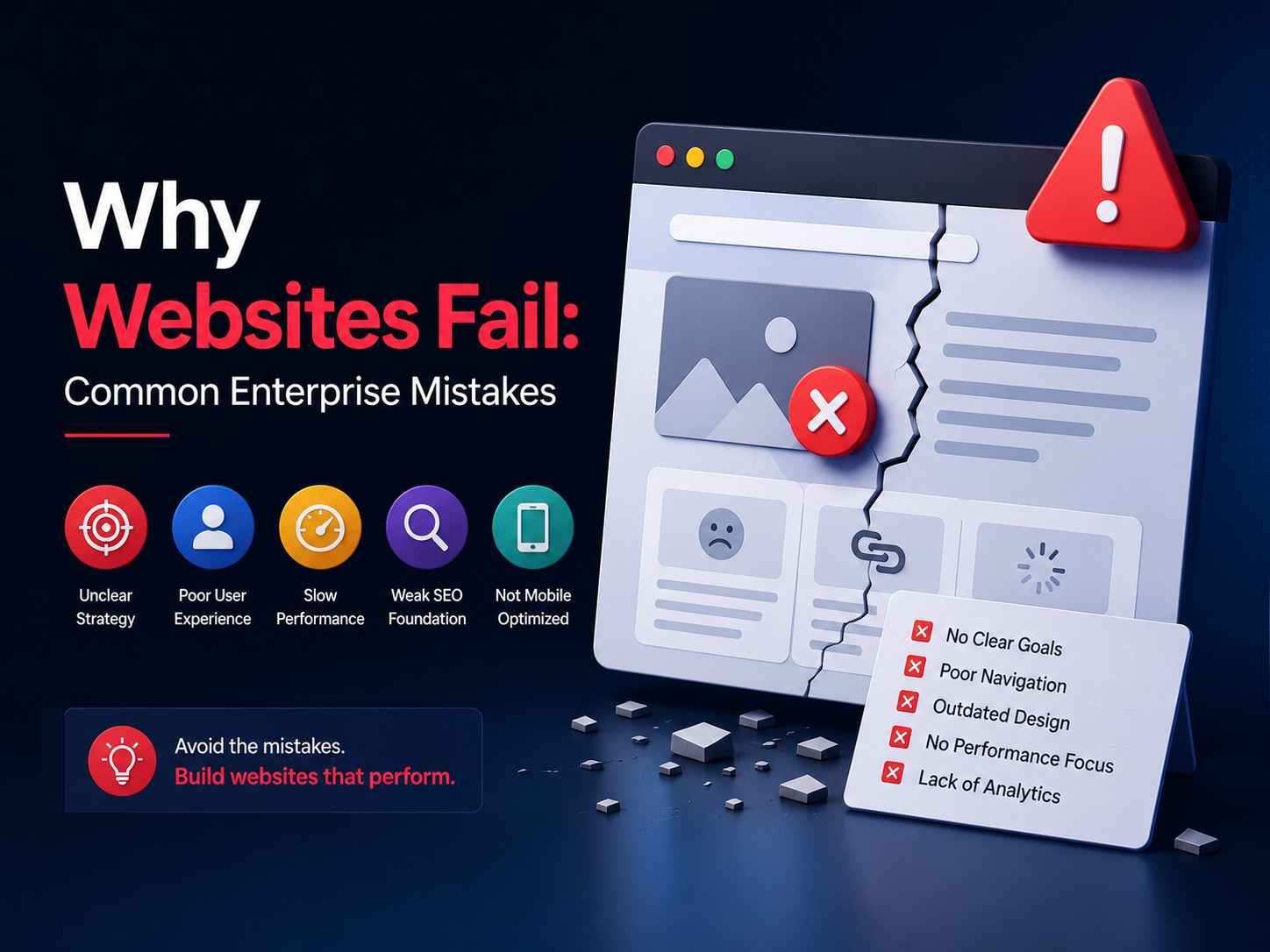


Quick Summary: What This Blog Covers
Discover the most common reasons enterprise websites fail—from unclear messaging and poor user experience to weak conversion strategies and slow performance. Learn practical ways to build a customer-focused website that drives traffic, engagement, and measurable business results.
Introduction
You spent months planning your new website. Your company invested serious money into the project. You brought in developers. You hired designers. You built something that looks amazing. You launched it feeling confident.
Then nothing happened. Traffic did not increase. Conversions stayed flat. Visitors came but they did not stick around. Your beautiful expensive website just sits there underperforming while your competitors gain ground.
This happens to enterprise companies constantly. Big budgets. Talented people. Professional processes. Yet somehow the website still fails. Not because of bad execution technically. Usually because of fundamental strategy mistakes that nobody caught until it was too late.
Most enterprise websites fail for the same reasons over and over. The same mistakes. Different companies. Same outcomes. Knowing these common mistakes helps you avoid them. Recognizing them early lets you fix them before they tank your entire project.
Digital Maxima watches enterprise websites launch and struggle constantly. The team has seen every mistake in the playbook. The team has also seen what works when companies actually avoid these traps. This guide walks you through the most common reasons enterprise websites fail and exactly what to do instead so your website actually performs.
Building a website for the wrong audience
This is the biggest mistake enterprise companies make. They build a website for themselves instead of building it for their actual customers.
Your company has a vision. Leadership has a brand story they want to tell. Marketing has messaging they want to emphasize. So the website becomes all about your company. Your story. Your values. Your achievements.
Except your customers do not care about any of that. They care about solving their problem. They care about what your solution does for them. They care about whether your company can help them get what they want.
A website built for your company instead of for your customers fails because it does not speak to what visitors actually want. Visitors land on your site looking for a solution. They find 10 paragraphs about your company’s journey instead. They leave and go to a competitor who actually addresses their problem.
Know your actual customer
Before building anything, define your actual customer precisely. Not a vague idea of customer. Real specific customer. Who are they. What problem do they have. What are they searching for. What would make them choose your solution over competitors.
Then build every page around addressing that customer’s actual needs. Your company story is background information. Your customer’s problem is foreground. Everything on your website should trace back to solving that problem for that specific customer.
Digital Maxima starts every enterprise website project by deeply understanding the actual customer and their actual problems. That understanding drives every design decision and every piece of content. Customers feel like the website was built for them because it actually was.
Ignoring how real people actually use your website
Enterprise teams spend months crafting perfect user journeys. They design flows that make perfect logical sense. Everything flows smoothly from one step to the next in the order they planned.
Then real users land on the website and immediately ignore the planned journey. They scan instead of read. They jump around looking for what they need. They use their phone instead of desktop. They get confused by navigation. They give up and leave.
The planned user journey was designed for how the company thinks people should use websites. Real users use websites completely differently. They are impatient. They are distracted. They have zero patience for confusion.
Building a website that works requires understanding exactly how real people actually use it. Not how you think they should use it. How they actually do use it.
Test with real users early and often
Do not wait until launch to find out that real users do not understand your website. Test constantly during development. Watch real people navigate your site. See where they get confused. See what frustrates them. See what makes them leave.
This user testing reveals problems that internal teams miss completely because internal people understand the company. They know what everything means. Real customers do not have that context. They need everything to be obvious immediately.
Digital Maxima runs continuous user testing throughout website development because the team knows that internal assumptions are often wrong. Real user feedback drives changes that actually improve performance.
Trying to say everything on every page
Enterprise companies have lots to say. Lots of products. Lots of services. Lots of capabilities. So they try to cram everything onto the homepage thinking they need to tell people about everything immediately.
Homepage turns into an overwhelming wall of information. Visitors do not know what matters. They do not know where to start. They do not know what the company actually offers. They get overwhelmed and leave.
The best enterprise websites are ruthlessly focused. Each page has one job. The homepage introduces the main offering. The product pages go deeper into specific products. The solution pages show how offerings solve specific problems. Each page is focused instead of trying to be everything.
Guide visitors to exactly what they need
Instead of trying to say everything, guide each visitor to exactly what they need based on who they are and what they are looking for.
Someone coming from Google searching for product A should land on the product A page, not the homepage. Someone looking for a solution to a specific problem should land on a page addressing that solution, not a generic overview.
This focused routing keeps people engaged because they immediately see content relevant to what they came looking for.
According to research from Nielsen Norman Group, websites with focused pages addressing specific visitor needs see 40% higher conversion rates compared to websites that try to serve all information to all visitors on every page.
Prioritizing company vanity over customer results
Enterprise websites sometimes become more about showing how big and successful the company is than about helping customers achieve results.
Massive hero images. Lots of client logos. Awards and recognition. Stories about company growth. All of this feels good internally but it does not help customers understand whether your solution actually solves their problem.
Visitors come to your website to evaluate whether you can help them. They do not care how many clients you have or how long you have been in business. They care about whether your solution works for their specific situation.
Focus on customer results over company achievements
Show what customers achieved using your solution. Case studies with actual results. Testimonials describing outcomes. Before and after examples showing transformation. Real data proving your solution works.
This focus on customer results is way more convincing than company achievements. Visitors can picture themselves getting similar results. That picture is what converts them into customers.
Poor website speed and performance
Enterprise websites sometimes become bloated. Tons of features. Heavy images. Tons of code. Lots of tracking scripts. The site works but it crawls.
Visitors on slow connections get frustrated. Mobile visitors especially suffer. Pages take forever to load. Content takes time to appear. Interactions are sluggish. The experience is miserable.
People leave slow websites. Studies show that even 3 second delays cause significant traffic drops. After 5 seconds, most visitors have already left. Your enterprise website that took months to build loses visitors in seconds because it loads too slowly.
Speed is a feature not an afterthought
Build with speed in mind from the start. Optimize images before they go live. Write efficient code. Use content delivery networks. Test performance constantly. Treat speed like a core feature because it is.
Digital Maxima treats website speed as critical and monitors performance obsessively because the team knows that speed directly affects whether people stay on your site long enough to convert.
Unclear value proposition and confusing messaging
Enterprise companies often have complex offerings. Products that do multiple things. Solutions that work in multiple ways. Capabilities that could be used for different purposes.
This complexity is real. But your website communication needs to be simple anyway. Visitors should understand in 5 seconds what your company does and how it helps them. If they cannot figure that out quickly, they leave.
Confusing messaging is one of the biggest reasons enterprise websites fail. People land on the site and have no idea what the company actually offers. The messaging is unclear. The value proposition is buried or vague. The main offer is not obvious.
Make your main offer crystal clear immediately
Your homepage should have one clear statement about what your company does and who it helps. That statement should be impossible to miss. Big. Bold. Clear. No ambiguity.
Everything else on your site should support that clear main message. Product details go deeper. Solutions address specific applications. But the main offer is clear and obvious immediately.
Outdated design and poor user experience
Enterprise websites sometimes look like they were built in 2010. Outdated design screams that the company is not innovating. Outdated design also usually means outdated underlying technology and poor user experience.
Web design trends exist for a reason. Modern design works better for user experience. Responsive design works on mobile. Modern layouts guide attention better. Current aesthetic feels more trustworthy.
A website that looks outdated signals that your company might be outdated too. People question whether your products or services are current. They worry about whether your company is still relevant.
Design should support function not distract from it
Modern enterprise design is clean. It guides attention toward what matters. It works beautifully on all devices. It uses whitespace intentionally. It makes navigation obvious.
Design is not decoration. Design is communication. Good design communicates clearly and gets out of the way. Bad design distracts and confuses.
According to Forrester Research, users form opinions about website trustworthiness within 50 milliseconds based primarily on visual design, making design quality critical to whether visitors trust your website enough to convert.
Ignoring mobile completely
Some enterprise websites still are not optimized for mobile. They work on desktop but mobile experience is an afterthought. Buttons are too small. Text is unreadable. Navigation is confusing. Images do not scale.
This is inexcusable because most web traffic is mobile now. If your website does not work well on mobile, you are losing the majority of your potential customers.
Mobile optimization is not optional. It is not nice to have. It is required. Your website has to work beautifully on phones and tablets or you are failing your audience.
Test on actual devices not just in browsers
Responsive design frameworks help but they do not catch everything. Test your website on actual phones. Actual tablets. Different sizes. Different browsers. Different networks.
What looks fine in a desktop browser might be broken on an iPhone. What works on WiFi might time out on 4G. Real device testing catches these problems so you can fix them.
Poor conversion optimization and weak calls to action
Enterprise websites sometimes treat conversion as an afterthought. The site informs visitors about your company and assumes they will somehow figure out how to become customers.
Conversion does not happen by accident. Conversion happens when you make it obvious exactly what you want visitors to do next and make that action easy.
Weak or missing calls to action means visitors get to the end of your content and have no idea what to do next. They do not buy. They do not contact you. They do not sign up. They do nothing.
Make your call to action obvious and easy
Every page should have a clear call to action. What do you want visitors to do. Sign up. Buy. Contact. Schedule a demo. Make that action obvious and easy to take.
Multiple calls to action throughout your site means you catch visitors wherever they are in their journey. Someone not ready to buy might want to download a resource. Someone ready to buy should see a purchase option.
Not measuring anything or measuring the wrong things
Some enterprise websites launch and nobody ever measures whether they actually work. Traffic could be declining. Conversion rate could be terrible. Bounce rate could be horrible. Nobody knows because nobody is tracking anything.
Measuring the right metrics tells you whether your website is working and what to improve. Measuring the wrong metrics misleads you into thinking your site is successful when it is actually failing.
Digital Maxima sets up proper measurement on every website so you know exactly how it performs. The team tracks metrics that actually matter. Not vanity metrics. Real business metrics.
Know your critical metrics
Define the metrics that actually matter for your business. Maybe it is conversions. Maybe it is phone calls. Maybe it is email signups. Maybe it is content downloads. Define what success actually looks like then track whether you are achieving it.
Review metrics regularly. Monthly at minimum. See what is working. See what is not. Fix what is not working.
Launching and then abandoning your website
Some enterprise websites launch and then nobody touches them for years. Content gets stale. Technical updates never happen. Security vulnerabilities never get patched. The website slowly becomes irrelevant and unsafe.
Your website is not a one time project. It is a living platform that needs constant attention. Content needs updating. Design needs refreshing. Technology needs updating. Security needs maintenance.
Abandoning your website after launch is like building a building and then never maintaining it. It slowly falls apart.
Treat your website like the important asset it is
Assign someone responsibility for your website. Update content regularly. Monitor performance. Fix issues quickly. Refresh design periodically. Keep technology current. Maintain security constantly.
A well maintained website that gets better over time outperforms a fancy website that gets abandoned.
Making your website actually work
Enterprise websites fail because of strategy mistakes not because of execution problems. Fix the strategy and your website performs better.
Understand your real customer and what they actually need. Guide them to exactly what matters to them. Keep messaging clear and focused. Optimize for the way real people actually use websites. Make conversion obvious and easy. Measure what matters.
Digital Maxima helps enterprise companies avoid these mistakes by building websites based on customer needs and proven conversion principles. The team knows what actually works because they have built hundreds of enterprise websites that succeed. Start building your successful website today and create a digital asset that actually drives business results.
Common questions about enterprise website failures
How long should an enterprise website last before redesign?
Modern websites should get refreshed every 2 to 3 years to stay current with design trends and technology. Content should update constantly. Full redesigns are less common now. Most websites get incremental improvements and updates rather than complete overhauls.
What if my website looks great but does not convert?
Beautiful design that does not convert usually means poor conversion optimization. Weak calls to action. Confusing messaging. Unclear value proposition. Pages that do not guide people toward action. Digital Maxima specializes in fixing beautiful websites that underperform by improving conversion strategy.
How do I know if my website is actually failing?
Track real metrics. Compare to industry benchmarks. Compare to your own previous performance. If traffic is declining. Conversion rate is declining. Bounce rate is high. Cost per conversion is rising. Those are signs your website is failing and needs improvement.
Can I fix my existing website or do I need to rebuild?
Most websites can be improved incrementally. Fix the biggest problems first. Improve conversion. Update outdated sections. Refresh design gradually. Complete rebuilds are expensive and sometimes unnecessary. Start with improving what you have.
Who should be responsible for making sure my website works?
Assign clear ownership. Maybe it is your marketing team. Maybe it is a digital director. Maybe it is an agency partner. But someone specific needs to be accountable for website performance and continuous improvement. Websites that have no clear owner tend to fail.