

This Blog Covers
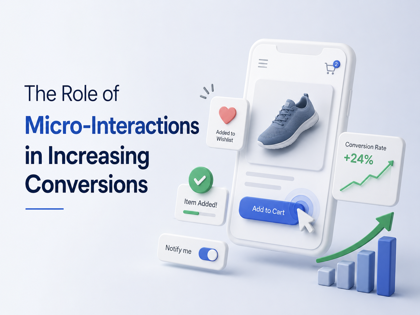
This blog details how small UI responses such as feedback when clicking buttons, validation on forms, loading indicators and many more enhance the UX and foster trust when visiting a website.
It illustrates what these micro interactions do to eliminate friction, take the users on a seamless journey and ultimately enhance conversions without big design changes.
Introduction
When people talk about website conversions, they typically focus on the major changes. A new landing page. A redesigned homepage. An alternative fee structure. User experience (UX) is completely overhauled.
Those things are important, too. However, with all of the industries that we’ve worked with at Digital Maxima, we’ve noticed something interesting. The best changes are the little ones.
A button that sounds when the mouse rolls over top of it. Progress display when checking out. Fine grained confirmation message upon form submission A series of these seemingly insignificant moments can have a huge impact on the users’ emotions when interacting with a website.
That’s where the discussion about Micro Interactions Increase Conversions starts!
Most visitors aren’t aware of these details. But they just have the sense that the site is more user-friendly, more reliable and more intuitive. The outcome will frequently appear in the metrics. Higher engagement. Better completion rates. More leads. More sales.
The truth is simple. Digital experience is as much about what people experience as it is about what they see.
What are micro interactions?
A micro interaction is a small response that happens when a user performs an action. You have probably encountered hundreds of them today without thinking about it.
Examples include:
- A button changing color when you hover over it
- A heart icon filling when you like a post
- A checkmark appearing after completing a form field
- A loading indicator showing progress
- A password strength meter during account creation
These interactions often last only a few seconds. Yet they communicate something important. They tell users that the system is working. They remove uncertainty. They create feedback. According to the user experience research published by Nielsen Norman Group, users feel more confident when interfaces provide clear and immediate feedback after actions. That confidence directly influences how people move through a website. The best micro interactions feel so natural that users barely notice them.
Why people abandon websites
Many businesses think that people leave their website because it is too expensive or they do not like the products. Sometimes this is true. But a lot of the time people leave because they get confused about something. For example a button might not look like you can click on it. A form might seem like it is not working right. A page might take a long time to load and you do not know what is going on. The checkout process might seem weird. These things can make people frustrated. Little things can stop someone from buying something. Think about going into a store and asking someone who works there a question. If they just stare at you and do not say anything you will feel weird away. Websites are the way. People expect something to happen when they do something on a website. When nothing happens they start to feel unsure. That is why Micro Interactions can help people buy things more than businesses think. Micro Interactions can make a difference. People like it when they get feedback from a website. Micro Interactions give people feedback. So businesses should use Micro Interactions to help people feel more comfortable, on their website.
Small moments create trust
Trust plays a bigger role in online conversions than most people think. When someone lands on your website, they often know very little about your company. They look for clues. Professional design helps. Clear messaging helps. Micro interactions help too. Consider a contact form. A user fills in their information and clicks submit. Now imagine two different experiences. In the first scenario, nothing happens for several seconds. The user starts wondering:
- Did the form work?
- Should I click again?
- Did something break?
In the second scenario, a confirmation message appears instantly. The user knows the request was successful. That small interaction removes uncertainty. It creates confidence. Confidence encourages action. This principle appears throughout successful digital experiences. Research from Interaction Design Foundation highlights how user feedback mechanisms improve perceived usability and reduce frustration during digital interactions.
Why micro interactions influence human psychology
People like clarity. They like knowing that their actions produce results. That preference goes deeper than website design. It connects to basic human behavior. When people press a button, they expect a response. When they complete a task, they expect recognition. When they move forward, they want reassurance. Micro interactions satisfy those expectations. A progress bar during checkout provides reassurance. A confirmation animation signals completion. A visual response confirms that the system understands the user’s action. These details reduce mental effort. And when something feels easier, people are more likely to continue. That is a major reason why Micro Interactions Increase Conversions across so many industries.
The difference between functional and memorable websites
Many websites function perfectly. Visitors can navigate them. Pages load correctly. Forms work. Products appear. Yet they still struggle with conversions.
Why? Because functionality alone does not create engagement. The most effective websites feel responsive. They feel alive. They create a sense of conversation between the user and the interface. Think about some of the world’s most successful digital products. Platforms like Figma, Slack, and Notion invest heavily in interaction design. They understand that users remember experiences, not just features.
A website that responds naturally feels easier to trust. That trust often translates into measurable business results.
Micro interactions reduce decision fatigue
Modern consumers make countless decisions every day. Every additional decision requires effort. Good user experience reduces that effort.
Micro interactions help guide people through the process. For example, a multi step form might include:
- Progress indicators
- Visual completion markers
- Inline validation messages
These elements help users understand where they are and what happens next. Without them, uncertainty increases. With them, the experience feels manageable. Research from Baymard Institute consistently shows that reducing checkout friction improves completion rates across ecommerce websites. Many of those friction points involve missing feedback and unclear interactions.
Where micro interactions make the biggest impact
Not every interaction affects conversions equally. Some areas create more influence than others.
Calls to action
Buttons represent critical conversion points. Simple hover effects and click feedback reassure users that their action worked. Without feedback, hesitation increases.
Contact forms
Forms create anxiety. People worry about mistakes. Inline validation helps immediately. Instead of waiting until submission, users receive guidance while completing the form.
Checkout experiences
Checkout processes benefit greatly from progress indicators and confirmation messages. These elements reduce uncertainty and encourage completion.
Account creation
Password requirements often frustrate users. Real time feedback removes confusion. Users know exactly what needs attention.
Mobile experiences
Mobile users rely heavily on visual cues. Micro interactions help compensate for limited screen space and touch based navigation.
Common mistakes businesses make
One of the biggest mistakes is treating micro interactions as decoration. They are not decorative elements. They serve a practical purpose. Another mistake involves overdoing them. Too many animations can become distracting. The goal is clarity, not entertainment. The most effective micro interactions feel natural. Users should benefit from them without consciously thinking about them. At Digital Maxima, we often see businesses add flashy effects while ignoring useful feedback mechanisms. A simple confirmation message often creates more value than an elaborate animation sequence.
Why conversions are emotional decisions
Many marketers focus heavily on logic.
- Features.
- Pricing.
- Specifications.
- Benefits.
- All of those matter.
But people rarely make decisions based entirely on logic. Emotion influences every conversion.
- Trust.
- Confidence.
- Comfort.
- Security.
Micro interactions support these emotions. When users feel confident, they move forward. When they feel uncertain, they leave. The difference often comes down to small moments. That is why Micro Interactions Increase Conversions even though many users never consciously notice them.
Real world examples
Think about ordering food online. You select items. Add them to your cart. Adjust quantities. Complete checkout. Throughout the process, small interactions guide every step. Buttons respond. Quantities update instantly. Notifications confirm actions. Progress indicators show movement. Without those interactions, the experience feels confusing. The same principle applies to lead generation websites, ecommerce stores, SaaS platforms, healthcare providers, and local businesses. Every website benefits from reducing uncertainty. Every website benefits from increasing clarity.
The future of user experience
As technology evolves, user expectations continue to rise. People compare your website against every great digital experience they have ever had. Not just your competitors. Every experience. That means users increasingly expect smooth interactions, instant feedback, and intuitive navigation. Businesses that ignore these expectations risk losing conversions to competitors who pay attention to the details. The gap between good and exceptional user experience often comes down to small refinements. Micro interactions represent one of those refinements.
Final Thoughts
When businesses look for ways to improve conversions, they often search for major solutions. Sometimes those solutions are necessary. But many conversion improvements come from smaller changes that remove friction and build confidence.
- A reassuring message.
- A responsive button.
- A progress indicator.
- A subtle confirmation.
Individually, these details seem minor. Together, they shape the entire user experience.
That is why Micro Interactions Increase Conversions. They help people feel confident. They reduce uncertainty. They guide users through important actions without creating frustration.
At Digital Maxima, we have seen firsthand how small user experience improvements can create meaningful business results. The websites that convert best are rarely the ones with the flashiest designs. They are the ones that make every interaction feel clear, intuitive, and effortless.
If your website attracts visitors but struggles to convert them, it may be time to look beyond the big changes and focus on the small moments that influence every decision. For businesses looking to improve digital performance, explore our internal resource on conversion rate optimization services to discover practical ways to turn more visitors into customers.
FAQs
Micro interactions are small interface responses that occur when users perform actions, such as clicking buttons, completing forms, or navigating through a website.
2. Why do micro interactions matter for conversions?
They provide feedback, reduce uncertainty, improve usability, and help users feel more confident while completing important actions.
3. Can micro interactions improve lead generation?
Yes. Better form feedback, clearer calls to action, and improved user guidance often increase form completions and lead submissions.
4. Do micro interactions help mobile users?
Absolutely. Mobile users rely heavily on visual feedback because touch interactions do not provide the same physical response as desktop interactions.
5. Should every website use micro interactions?
Yes, but strategically. The goal is to improve usability and clarity rather than adding unnecessary animations or distractions.