

Quick Summary: What This Blog Covers
This blog explains how conversion first website wireframing helps turn visitors into customers by prioritizing user actions before visual design. It covers strategic page layouts, conversion focused elements, mobile first planning, and wireframing techniques that create websites built to generate real business results.
Introduction
You built a website. It looks gorgeous. The design is modern. The colors pop. The layout is clean and professional. You launched it and waited for sales to roll in.
Then nothing happened. Crickets. Visitors come but they do not buy anything. They do not fill out forms. They do not click your calls to action. They just scroll around and leave.
This happens to tons of businesses and most of them have no idea why. They assumed that looking good equals performing well. But looking good and converting visitors into customers are two completely different things.
The problem usually started way before the design phase. It started during the wireframing phase when nobody was thinking about conversion. Everyone was focused on how the site looked. Nobody was focused on how it performs.
Conversion first website wireframing changes this entire approach. Instead of designing a website and hoping it converts, you design specifically to convert from the very beginning. Every element serves a purpose. Every layout decision supports your goal of turning visitors into customers.
Digital Maxima has watched this play out with hundreds of clients. Websites that look amazing but do not convert. Websites that look basic but convert like crazy. The difference almost always comes down to the wireframing phase and whether conversion was the focus or an afterthought.
This guide walks you through what conversion first website wireframing actually means and how to build wireframes that turn browsers into buyers. This is not about making your site look pretty. This is about making your site work.
Understanding what wireframing actually does
Before diving into conversion focused wireframing, you need to understand what wireframing is and why it matters at all.
A wireframe is basically a skeleton of your website. No colors. No images. No fancy fonts. Just boxes and text showing where elements go on the page. The layout. The structure. The flow of information from top to bottom.
Most designers use wireframing to plan out their visual design. They create wireframes showing roughly where things go. Then they build the actual design on top of that skeleton.
But most wireframes are created without any thought about conversion. Designers focus on aesthetics and user experience but not on whether the layout actually drives sales or leads.
Why conversion gets ignored during wireframing
Here is the honest truth. Most people doing wireframing are designers. Designers care about how things look and flow. They care about spacing and balance and visual hierarchy. They do not necessarily care about conversion psychology or sales funnels or user behavior patterns that lead to purchases.
Nobody is blaming designers for this. It is just not what they were trained to focus on. But it is a huge missed opportunity because wireframing is the perfect time to build conversion into your design from the ground up.
The conversion first mindset changes everything
Conversion first wireframing starts with a completely different question than traditional wireframing. Instead of asking “how should this look,” you ask “how do we get visitors to take action.”
This mindset shift changes every decision you make during wireframing. Where you put your call to action. How you arrange content. What you prioritize. What you hide or minimize. Everything flows from the goal of driving conversions.
Start with your actual conversion goal
Before you create a single wireframe, you need to know exactly what you want visitors to do. Buy something. Fill out a form. Schedule a call. Download something. Whatever your goal is, write it down.
Digital Maxima starts every project by getting crystal clear on the primary conversion goal. Everything else follows from that goal. The wireframe serves that goal. The design serves that goal. The content serves that goal.
This seems obvious but most businesses never do it. They have vague ideas about wanting more sales but they never articulate exactly what action they want visitors to take on each page.
The elements that actually drive conversions
Certain elements on a webpage drive conversions way more than others. Knowing which elements matter lets you design wireframes that emphasize the right things.
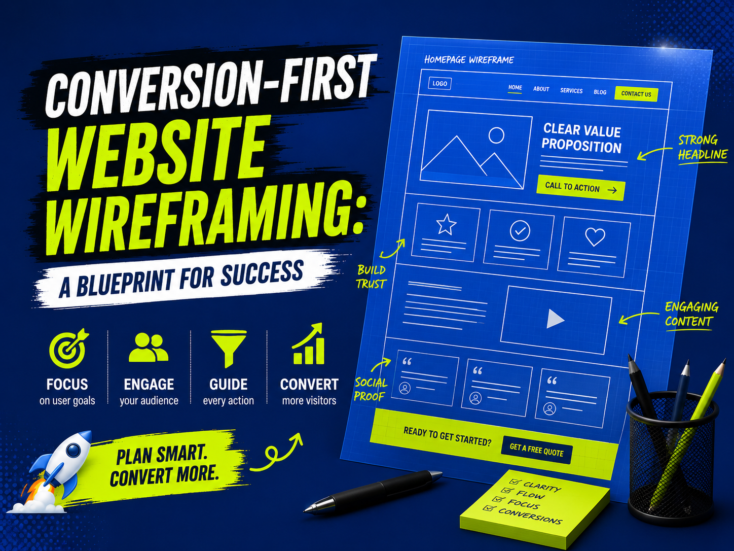
Clear value propositions at the top
Visitors spend maybe three seconds on your site before deciding whether to stay or leave. In those three seconds, they need to understand why they should care. What does your business do. How does it help them.
Your wireframe should put your clearest value proposition at the very top of the page. Above the fold. Right where everyone sees it first. Not buried below six paragraphs of flowery content.
Most websites do the opposite. They put a big image at the top or some motivational headline that sounds great but does not actually tell visitors what you do.
According to research published by Neil Patel, websites with clear value propositions above the fold see 64% higher conversion rates compared to websites where value propositions are below the fold or buried in body text.
Make your wireframe show the value proposition prominently at the top of every page. Everything else should support that main message.
Strategic call to action placement
Your main call to action button should appear multiple times on your page. Once at the top near your value proposition. Again in the middle. Again at the bottom. Maybe a couple more times in between depending on page length.
People do not always scroll all the way to the bottom. If your only call to action is at the very bottom, tons of visitors miss it. Repeating your call to action throughout the page means you catch people regardless of where they stop scrolling.
Your wireframe should show exactly where these calls to action appear and how they flow through the page content.
Form placement for lead capture
If you want visitors to fill out forms, where the form sits on the page matters hugely. Too early and visitors do not trust you enough to share their information. Too late and they have already left.
Most conversion experts recommend asking for information after you have explained your value and built trust. Your wireframe should show the natural flow from value proposition to trust building to form placement.
For some industries, a form on the side of every page works great. For others, a dedicated form page works better. Your wireframe should test different placements based on your specific business.
Visual hierarchy guides attention
Your wireframe should use size and spacing to guide attention toward your most important elements. Biggest element at the top. Secondary elements medium sized. Less important details small.
This visual hierarchy should guide visitors’ eyes toward your conversion goals naturally. Your wireframe should show this hierarchy clearly even though wireframes have no colors or images yet.
The conversion funnel wireframe approach
One powerful way to think about conversion first wireframing is as a funnel. Each section of your page moves visitors one step closer to conversion.
Awareness section
The top of the page is where you create awareness. You explain who you are and what you do. Your wireframe should show clear messaging here with your main value proposition and a compelling headline.
Interest section
Once visitors know who you are, the next section builds interest. You explain why your solution matters. What problems does it solve. Why should they care.
Your wireframe should show space for this section with room for supporting details, maybe some proof points or testimonials showing that your solution works.
Consideration section
Now visitors are interested. The consideration section addresses their doubts. You show pricing. You explain how your solution compares to alternatives. You maybe show a case study proving your solution actually works.
Your wireframe should show space for comparison information or detailed explanations answering common objections.
Decision section
Finally comes the actual conversion moment. Your call to action. The form. The checkout. Whatever specific action you want visitors to take.
Your wireframe should make this decision section obvious and easy to access. Not hidden. Not complicated. Just right there.
This funnel wireframe approach ensures every section of your page serves a purpose in moving visitors toward conversion.
Data from HubSpot shows that websites using clear funnel wireframes see conversion rate improvements averaging 28% compared to websites with no clear flow structure.
Layout patterns that convert best
Certain layout patterns have proven track records for driving conversions. Knowing these patterns lets you build them into your wireframes.
Hero section plus clear CTA
A hero section at the top with a compelling image or video, powerful headline, and clear call to action works incredibly well. Your wireframe should show this pattern clearly.
Feature list with benefit focused copy
After your hero, listing out three to five key features with benefit focused copy describing why each feature matters drives conversions. Your wireframe should show this section with space for feature icons or images plus copy.
Social proof section
Testimonials. Case studies. Client logos. Ratings. Anything showing that real people love your product. Your wireframe should include dedicated space for social proof.
Final strong CTA
End your page with another strong call to action. Repeat your main message. Remind visitors what you want them to do. Make it easy to take action.
Your wireframe should show this final section prominently.
Mobile first means wireframing mobile first
Mobile devices are how most people browse the web now. But tons of wireframes still get created for desktop first, then squeezed awkwardly onto mobile.
Conversion first wireframing means starting with mobile. Design your wireframe for small screens first. Make sure your conversion flow works when someone is on a phone with a tiny screen.
Then expand to desktop. Desktop has more space so you can add more supporting elements. But the core conversion flow stays consistent between mobile and desktop.
Digital Maxima always wireframes mobile first. The team builds the conversion funnel for phone screens. Then adapts it for larger screens. This approach keeps conversion at the center of every decision.
Wireframing the actual user journey
Real users do not read your site in the order you laid it out. They jump around. They skip sections. They scan instead of read. Your wireframe needs to account for actual user behavior.
Create wireframes showing different user journeys. How does someone who is already familiar with your business navigate the page. How does a complete newcomer navigate it. These journeys might be different.
Your wireframe should support both journeys and guide each type of visitor toward conversion through their specific path.
Testing your wireframe before design
The beauty of conversion first wireframing is that you can test whether your layout actually works before spending money on design. Use tools like Figma or Adobe XD to create clickable wireframes that simulate the actual user experience.
Run these wireframes by real people. Watch how they navigate. Do they find your call to action easily. Do they understand your value proposition. Do they get confused anywhere.
This testing reveals problems in your conversion flow before you invest in the actual design. Fixing your wireframe costs nothing. Fixing your design after it is built costs tons of money and time.
Why this approach beats guessing
Building a website without conversion first wireframing is like driving without looking where you are going. You might end up somewhere but probably not where you wanted to be.
Conversion first wireframing puts you in the driver’s seat. You make intentional decisions about layout and structure. You build for your conversion goal from the very beginning. Every element serves your business purpose.
The result is a website that looks good and actually works. Visitors convert. Your business grows. Everything aligns.
Digital Maxima uses conversion first wireframing on every project because it works. The team has seen the results. Websites built with this approach consistently outperform websites built with traditional design-first approaches.
Your next website does not have to be a guessing game. Start with a conversion focused wireframing strategy and build a site that actually drives business results.
Common questions about conversion first wireframing
Does conversion first wireframing mean my site will look ugly?
Not at all. Conversion first wireframing focuses on strategy and layout. The actual design can look beautiful. In fact, good designers can make conversion focused layouts look absolutely stunning. The wireframe is just the blueprint. The design is where the beauty comes in.
Can I apply conversion first wireframing to an existing website?
Absolutely. You can wireframe your current site and identify where conversions are getting blocked. Then update the actual design to match a conversion focused wireframe. You might be surprised how simple layout changes improve your conversion rates dramatically.
How long does conversion first wireframing take?
The wireframing process typically takes one to two weeks depending on site complexity. More pages means more wireframes. But this upfront investment saves tons of time and money later because your designer knows exactly what to build and why.
What tools do I use for conversion first wireframing?
Popular wireframing tools include Figma, Adobe XD, Wireframe.cc, and even basic tools like pencil and paper. The specific tool matters less than the thinking you put into your wireframe. Digital Maxima uses whatever tool works best for each specific project and client preference.
How do I know if my wireframe actually works for conversions?
Test it. Get real people to click through your wireframe. Watch where they get confused. Pay attention to whether they find your call to action easily. Ask them directly if they understand your value proposition. Real user feedback reveals whether your wireframe actually drives conversions or if you need to adjust.